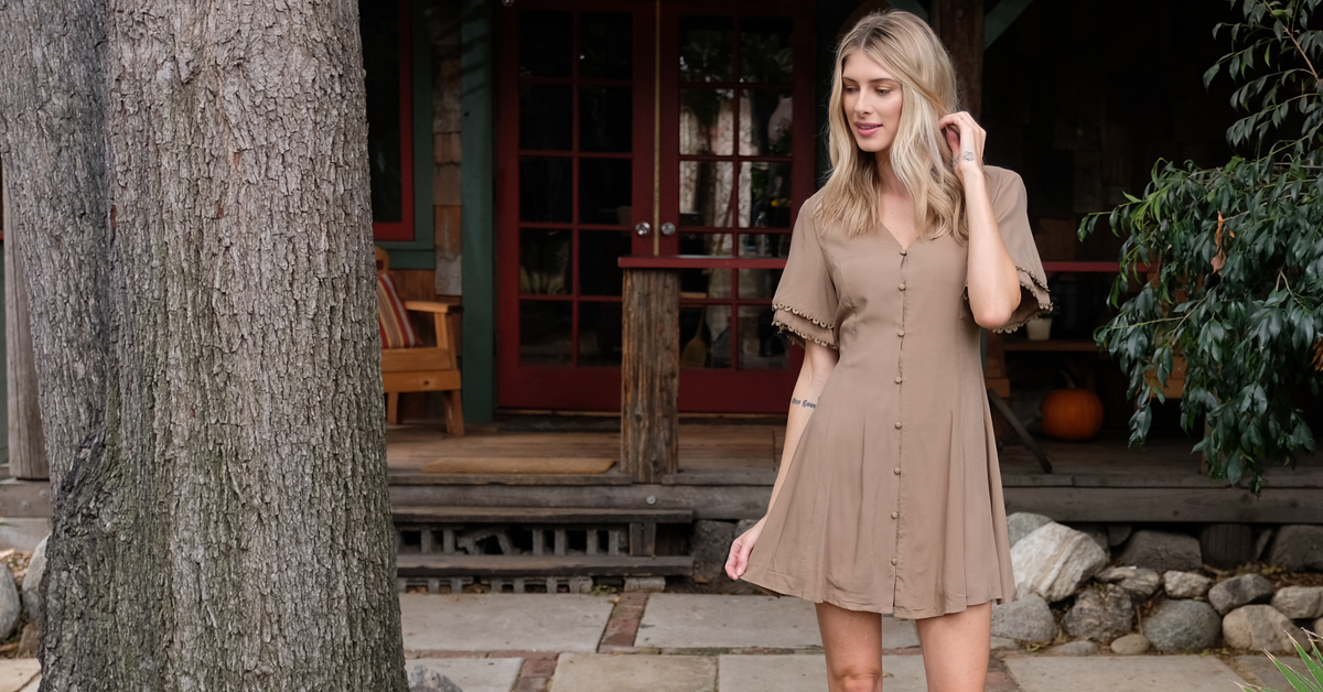
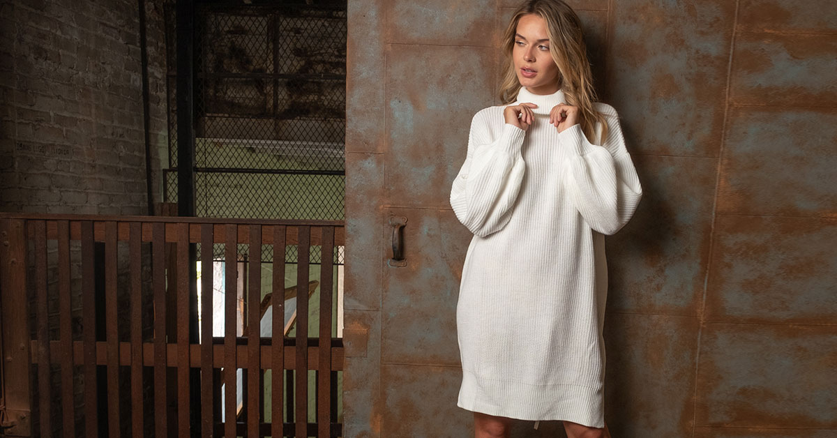
When it comes to welcoming new shoppers to your boutique, there’s no substitute for a stellar first impression. If your store looks fresh, creative, and well organized, customers are more likely to feel inspired by your product—and start planning their return trips! By contrast, a space that’s cluttered and chaotic will cut any shopper’s visit short. All of this means that a strong visual merchandising strategy is essential for creating a successful boutique; here are five tips for taking the look of your store to the next level.
Create Welcoming Windows: Creative windows are key to the brand image of many large retailers—think about the elaborate concepts at Anthropologie, or the holiday season displays along Fifth Avenue. For many shoppers, a peek at your window displays is their first-ever interaction with your boutique. This means that windows are a crucial touchpoint for broadcasting what’s important to your business right now. Because customers are walking by, they have only a few seconds to process your window display—so keep your visuals sharp and focused. When designing your windows, stick to a single unifying theme, such as a key trend, seasonal occasion or striking color palette. This way, shoppers will immediately know what your boutique is all about and be eager to step inside.
Keep It Simple: Once your windows have invited customers inside, you’ll want to make sure they don’t feel overwhelmed by visual clutter. If your store includes a statement-making display or noteworthy built-in element, let that feature take center stage and keep the surrounding areas streamlined so customers can focus on your products. This means avoiding overstuffed racks, clashing colors, and too many mannequins vying for shoppers’ attention. Allowing some breathing room in your merchandising also elevates your product assortment by making each item seem specially chosen, rather than blending into a space that’s too busy and crowded.
Engage the Senses: While the primary focus of visual merchandising is the look of your boutique, the other senses are also important when it comes to shaping overall customer experience. Small touches that engage the senses help to make your customers feel welcome and create a memorable visit to your space. Start by curating a playlist that’s focused on softer and slower beats, which encourage customers to browse at a more relaxed pace. You might also choose to burn a signature candle in your store every day, so shoppers will associate your brand with a pleasant fragrance. Finally, encourage customers to explore your products through touch by keeping all of your items within easy reach; avoid high shelves or awkward stacks that might say, “Keep your hands to yourself.”
Refresh Regularly: As a boutique owner, you’re already aware of the importance of refreshing your product assortment on a consistent basis. One-time customers turn into regulars when they can count on you to offer new and exciting items; the same is true when it comes to planning your visual merchandising strategy. As a rule, you should change up your displays approximately once a month. This allows you to highlight new products, showcase trends you love, and remain relevant for seasonal occasions.
Incorporate Show-Stopping Signs: Though we often overlook store signage, it’s an essential component of successful visual merchandising. From a practical perspective, signs work to highlight key products and advertise promotions. When conveying information through signage, keep hierarchy in mind; your largest signs should focus on sales drivers like promotions and new arrivals, while informative signs should be much smaller in scale. Signage should also mesh seamlessly with the other visual elements of your boutique. Design your print materials using a color palette that coordinates with your window displays, key collections, and any permanent branded elements like your boutique logo. Finally, signage can be a great way to bridge the gap between your online and brick-and-mortar presence. Consider using design elements featured on your website or emails for in-store signage, so customers have a consistent brand experience no matter where they’re shopping.
What are your best tips for making your store stand out from the crowd? Share your favorite visual merchandising ideas in the comments—we can’t wait to hear from you!


Jessica
You have to be able to see the forest from the trees. I had a dozen different display and store design ideas, but couldn’t figure out how to make them work together until I invested in planogram and floor planner software. Every square foot has to be used effectively, even when that means leaving negative space to draw the focus to the most important displays and sales points.