In the springtime, pastels can be found everywhere in nature. Pink flowers bloom, pale yellow chicks titter about, and creamy orange and lavender shades paint the skies at sunrise and sunset. That’s why pastels are such popular colors in fashion during the season; we feel especially inspired by them around this time. Today, we’re sharing our tips on how to rock the pastel palette.
Pair with Prints
Pastels are, by their nature, pretty unassuming, so the best way to make them stand out is to add a little intrigue via colors or patterns. The easiest way to do this is by pairing your pastel piece with a patterned one.
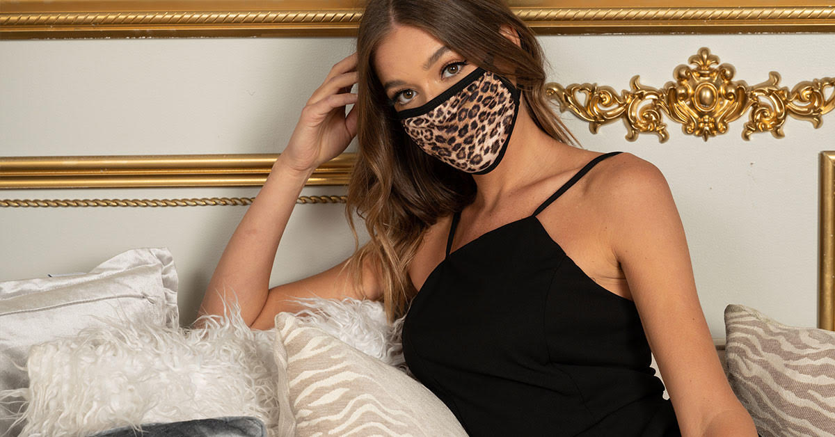
Take this lavender cardigan, for instance. It’s cute, whimsical even. But pair it with a fierce leopard blouse and you’ve suddenly got a much more striking ensemble. Plus, this way, you’re able to add a little color to your outfit without going overboard. A cheetah-print kimono paired with a hot pink top might be a bit much, but with a simple white top? That strikes just the right balance.
Experiment with Patterns
The other print-related option is to wear pastel pieces that already have patterns and prints on them. These polka-dotted lavender pants are a great start, with a simple pattern that draws the eye but isn’t too overwhelming. However, if you want something that stands out a bit more, we’ve got you covered.
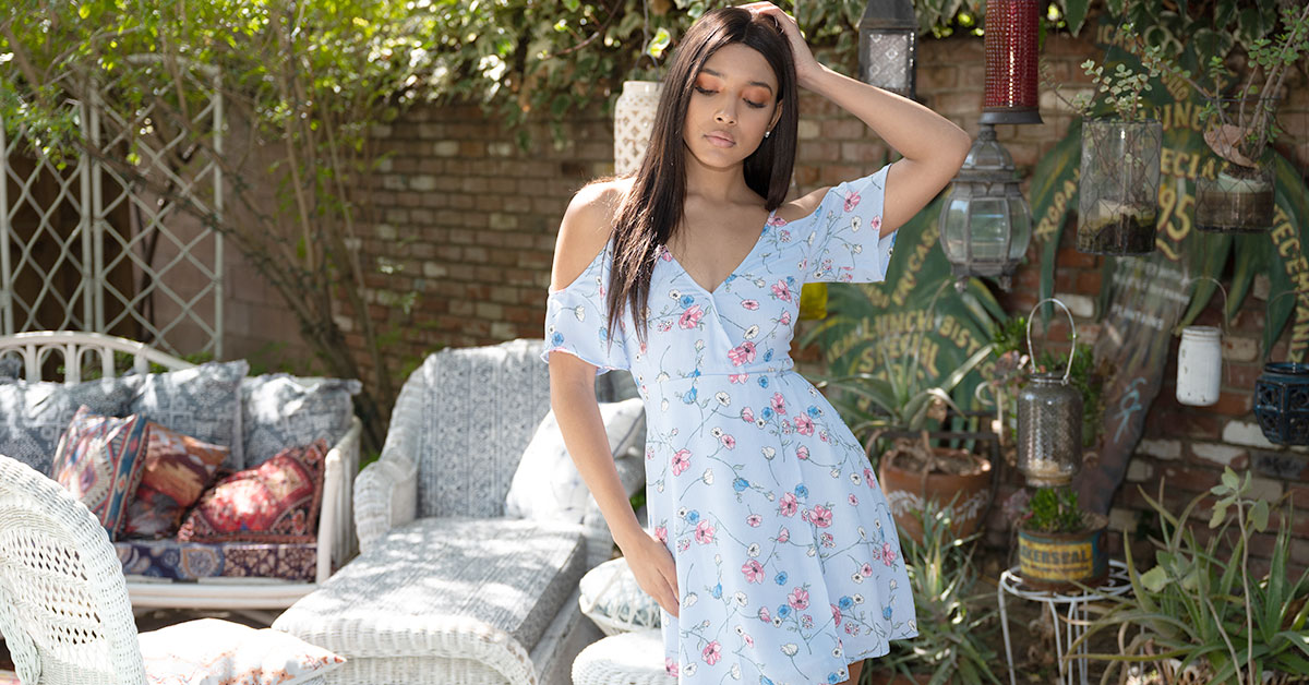
These fun, powder blue pants are adorned with brightly colored fruits and leaves, and they look great with a white tank top or blouse and some nude heels.
Make them Pop
Patterns are great, but the colors you pair with your pastel clothing have an equally huge impact on the overall aesthetic of your ensemble, and the role your pastel pieces will play.
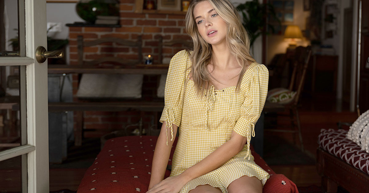
If you want your pastel pink pants to be the focal point of your outfit, you should pair them with neutral tones, like grays, tans, and creams. This helps the color in your pants stand out by comparison.
This pairing can occur on the same piece of clothing. The white dots on this lavender dress places more emphasis on the purple hue of the clothing, so even though the color isn’t especially intense, the resultant illusion makes the piece appear to be more vibrant.
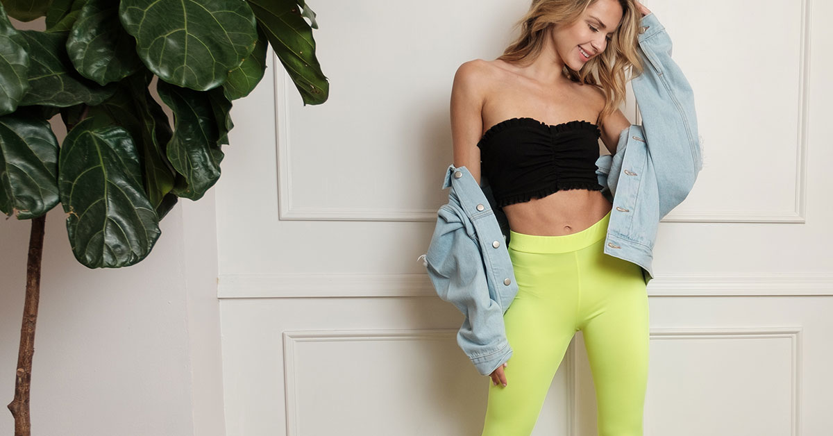
Add Saturated Pieces
Maybe you aren’t trying to make your pastel piece the center of attention. Perhaps you want it to work as an accessory to your ensemble, rather than as the piece you style the rest of your outfit around. If that’s the case, we recommend adding pieces with saturated, rich hues to your ensemble.
Pair with other Pastels
Pastel on pastel can be hard to pull off, but the trick is to combine completely different colors and hues that are still within the pastel family. If you try to pair periwinkle with a slightly different shade of periwinkle, it might not look right. But, pair a white skirt with a pale-yellow sweetheart neckline blouse, and the contrast will help to place emphasis on the unique aspects of both pieces.
If you do choose to combine pastels, we suggest large blocks of the same color, so that your style looks deliberate and bold, rather than overly distracting, like some sort of pastel tie-dye.
At the end of the day, there are so many different ways to style your pastels. They’re extremely versatile and come in all sorts of different colors, so even if they’re not as intense and eye-catching as neons and primary colors, you can still style them in a way that makes them just as effective.
—
No Comments